
Sub-Total: R0.00
THE TIME HAS COME!!!!!
BIG NEWS
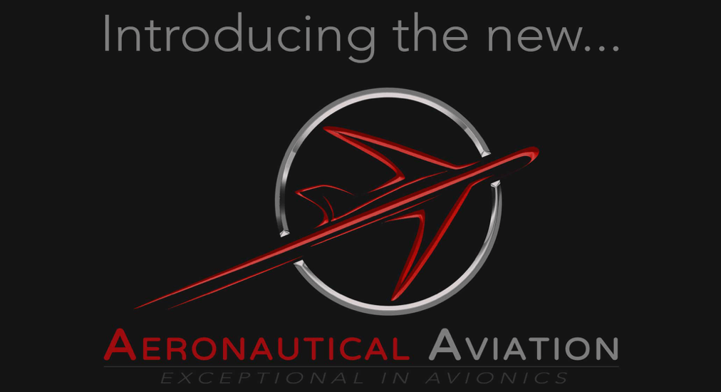
Today, after fourteen years, we’re releasing an updated brand identity, which includes a new logo and font. You’ll see the new look anywhere we are out in public, from our uniforms, our website, Facebook, Twitter, Instagram, our documentation and our vehicles. We believe the new look better matches how we have grown and what we have become since 2005: a service provider that is striving to keep up with technology, the ever-changing aviation industry, higher service levels and meeting the personal needs for each and every one of our clients. And, who better to understand the needs of a pilot than our director Clinton Carroll, who is a pilot himself.
Since our founding in 2005, we’ve stuck with the same “Bird” logo, although over the past few years we did slightly alter the colours to make them appear crisper and fresher. But in the last few years we’ve changed and grown as a company: we were now not only limited to instrumentation, but over the years launched our battery shop, avionics facility, online shop, and increased our autopilot facility. The old look started to chafe. The closed circle was limiting, and the bird felt like we were not representing an aviation facility. Needless to say, it was time for a change.
Our design goal was to better match how we look to our principles, values and the customers we serve. Our team, alongside our marketing agency worked to find something that appeared crisp, approachable, smart, connected and defining who we are.
We decided to stay true to our original colours with the red and grey and stuck to our roots.
The old circle was opened, but we still felt the need to include the circle because it is all encompassing and is symbolic of being in a position to offer our customers all round service for their aircraft needs. There are no restrictions as to the lengths we will go to assist our clients and what we believe we can achieve.
The aircraft within the logo represents the company industry, but it is stylized to appear as if it is taking off and soaring, to represent our growth and our continuous efforts in striving for higher quality, extraordinary workmanship and exceptional customer service.
We are still the same legal entity, with the same old faces you’ve come to trust over the years. We’ve just updated and modernized our look. We hope you like our new updated look and continue to support us in our journey forward. We have also moved into a new facility at Lanseria Airport, where we can provide better service to our customers and offer a more personalized experience with the same quality that we are proud of. We are now located at Hangar 202, Gate 7, Lanseria International Airport. All our contact details still remain unchanged. We hope that you will feel free to come and visit our new facility or just pop in for a chat.